Design
June 26, 2019
From scrolling down your twitter feed to a stroll through the mall, it’s easy to see that this year’s Pride is in full swing. The month-long LGBT+ celebration is a beautiful conglomeration of activism, history, parties, and even marketing? Brands promoting gay pride publicly was unheard 50 years ago (Which is when the historic Stonewall Riots occurred, leading the way for the modern gay pride movement.) However, now in our more socially-minded society, consumers care a lot more how a large brand impacts the world and it’s culture. With an increase in brands riding the inclusivity wave, it calls into question, does featuring and celebrating LGBT+ Pride positively or negatively impact consumer demand?
Inclusivity Marketing is creating content that truly reflects the diverse communities that your company serves. We have seen this in various movements from the #bodypositivity movement to #aeriereal campaign. Which shows models of all shapes and sizes flourishing in underwear ads. Brands are realizing marketing to every kind of person may be the way to attract new customers. Creating campaigns that showcase real people not just photoshopped models. Which allows more marginalized groups a chance to really connect with that brand, creating brand loyalty. An even simpler reason, is targeting a wider range of people equates to plainly, more eyes on your products. This more inclusive marketing trend combined with the Pride celebration’s continued growth. Means the month of June is the perfect showcase for large-scale inclusivity marketing. A mix of companies using their platform for good and some wanting to make money off of marginalized groups leaves a mixed-bag of interesting campaigns that are worth analyzing.
2019 Pride Content Examples
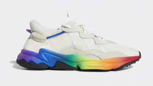
- Adidas – Released a Pride collection entitled “Pride pack”. Though not tied to product sales, Adidas will be supporting The Trevor Project, the world’s largest suicide prevention and crisis intervention organization for the youth of the community.
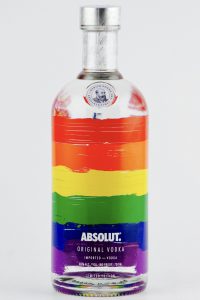
- Absolut Vodka – Using a myriad of LGBT+ influencers, Absolut Vodka is kicking off a campaign with multiple channels, including commercials, branded events during Pride weekend, and in addition to bringing back its iconic rainbow bottle, Absolut has launched a multi-year partnership supporting GLAAD’s work accelerating acceptance for the LGBT community.
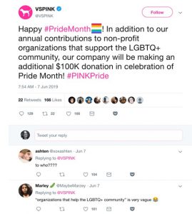
- Victoria Secret- Their brand Pink, tweeted their support for Pride month where they state that they will donate 100K to a LGBTQ+ Organization, the brand is still facing scrutiny over anti-trans comments made earlier this year.
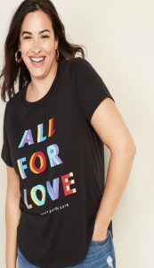
- Gap – Launched its “Love all ways” campaign highlighting what family means today and will donate 15% of proceeds to the U.N. Free and Equal Foundation.
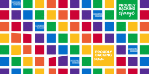
- American Express – Is celebrating Pride with a performance by Singer Lizzo. All proceeds will go to the Stonewall Community Foundation, an organization that bears part of its historic name to honor the 1969 uprising that started in New York and the spirit of freedom, resilience, and resolve that abides today. American Express is also displaying an array of Pride-themed ads over New York with messages of Pride and acceptance.
These are just some of the examples of what companies do during the month of June. What Makes them successful or scrutinized all depends on context.
How These Campaigns Were Received
Campaigns run by Absolut Vodka, Gap, and American Express have three things in common, that made their Pride campaigns successful. First, their brands support the LGBT+ Community throughout the year, not just in June. They do this with continued donations (American Express) and inclusive marketing (Gap and Absolut Vodka). Two, they specifically call out where they are donating their money, instead of just vaguely stating they are supporting the community. This makes the campaign seem more genuine. Lastly the pride/rainbow items they are selling are completely or in-part not for profit. The transparency demonstrated by these brands isn’t just a new fad.
Regan Clarke, Brand Director of Absolut Vodka, USA knows exactly where his brand belongs in all of this and is proud of it. Stating “Supporting the LGBTQ community back in 1981 was a risky decision for mainstream brands, when taking a stand for equality meant going against conventional culture.” Absolut’s 30+ year commitment to Pride is a great example of how inclusive marketing, can work and has worked. Demonstrating how powerful, socially aware marketing really can be when trying to further your brands position and satisfy younger consumers. These brands are creating an image for themselves as a positive presence in the world. Brand directors like Regan Clarke, show how putting time and effort into a pride campaign can really yield positive returns.
On the opposite spectrum is Victoria Secret. Earlier this year they had a major scandal involving their CMO Ed Razek. When he claimed transgender people don’t belong in the “coveted” Victoria Secret fashion show, because they don’t represent fantasy. “Dear Victoria’s Secret, you said trans women can’t sell the “fantasy” so here I am as a TRANS WOMAN selling the FANTASY! ماهي لعبة الروليت ” wrote trans makeup mogul, Nikita Dragun on her Twitter account in the weeks following the 2018 fashion show disaster. Fans were quick to bring Dragun’s tweet up again when Victoria’s Secret attempted to voice support for the LGBTQ+ community during pride month (The Tweet above). Showing how consumers are quick to call out inconsistency and injustice within a brand. The brand has not fully recovered from Ed Razek’s comments. كيف تلعب القمار This tweet sent out for Pride makes the company look even more out of touch. Only helping in bringing up past scandals and driving even more consumers away.
Adidas similarly has a bad reputation when it comes to supporting the LGBT+ community year round. The company is a huge sponsor for the Olympics, which took place in Russia in 2014. قواعد لعب البوكر Russia’s anti-gay policies are well documented and many LGBT+ Individuals from all over the world run the risk of these harsh policies by traveling to and participating in the games. Many consumers called them out, saying the company is not truly LGBT+ supportive when they are helping fund the Olympics in such a dangerous place for the community. Many calling their “Pride Pack” a cash grab because of LGBT+ consumers’ desire for rainbow everything during Pride. The “Pride Pack” seems disingenuous because the money made from, those shoes specifically, all goes into Adidas’ pocket.
The donations they are giving to the Trevor foundation are appreciated and valid, but many consumers seem to be unhappy with the broad claims of supporting the Trevor Project because isn’t being transparent about the actual amount or percentage of product sales that they are donating. Vox writer Alex Abad-Santos summarizes what Adidas is doing perfectly stating that “Brands promoting gay pride and the LGBTQ community may not always be consistent in actually supporting the LGBTQ community, but they still capitalize on the help that people want to give that community.” With their continued support of an event that isn’t LGBT+ friendly like the 2020 Olympics consumers are smart enough to realize that this brand doesn’t really have the LGBT+ communities best interest at heart year-round, only when it might seem convenient.
Is Marketing During Pride Worth The Risk?
A good Pride campaign can break boundaries, start meaningful conversations and position your brand favorably with a growing audience. On the flip-side, brands whose campaigns seem like lazy cash grabs will dig their company into a very big hole both on social media and with the general public mindset. Consumers are savvier than they have ever been and can tell when a brand is being genuine in their marketing. Companies like Gap and American Express clearly state where the money raised from their Pride campaigns is going and it is that transparency that draws in the modern consumer. In today’s age consumers vote with their dollars, many choose not to support brands that don’t align with their views. It’s up to brands to decide where they will fall politically and socially because it might affect their bottom line.
January 11, 2018
The world of advertising is ever-growing and ever-changing. As it changes, so do we. Peak Seven Advertising is always moving forward and is always dedicated to the successes of our clients. For our Year In Review, let’s delve into the website projects that made 2017 such a successful year for Peak Seven and and even more successful year for our clients!
The internet is a creature of pure power and harnessing that power is key to finding your client’s online market. كازينو اونلاين This year, PeakSeven created, designed, redesigned and launched more than a few beautiful new websites for our clients and it is our pleasure to share them with you.
Top 5 Peak Seven Website Redesigns
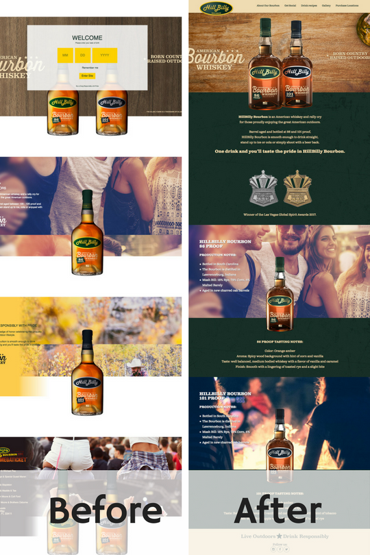
HillBilly Bourbon is one of our favorite clients. We completely reimagined the architecture of the previous website in order to show-off just how amazing their product is. We kept in mind the core message of the brand, Born Country Raised Outdoors. Take a look at the transformation here hillbillybourbon.com
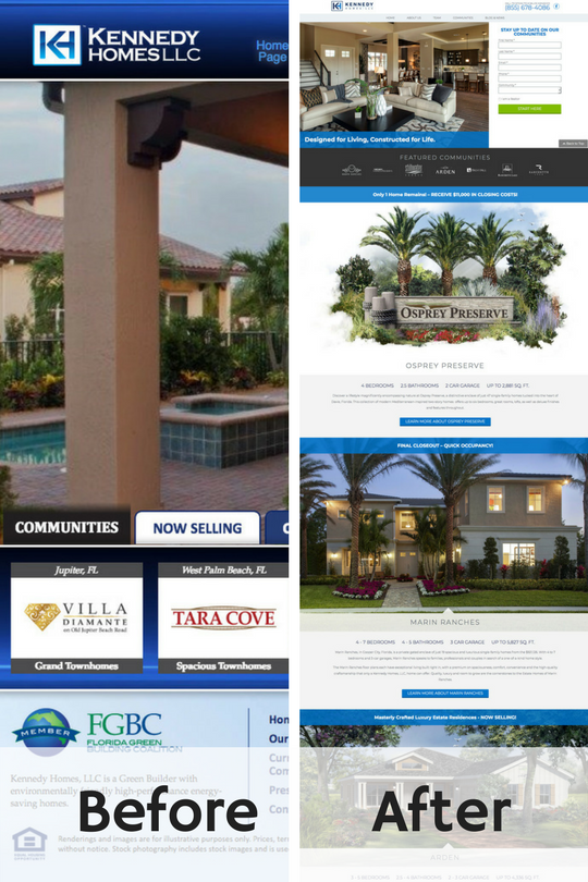
The primary reason for Kennedy Homes’ website redesign was to improve conversion rates, while reflecting the prestige and heritage of the brand. With this as our goal, we set out to put the consumer’s information at the forefront of the website, making it easy to use and a joy to explore. Take a look for yourself here: kennedyhomesllc.com
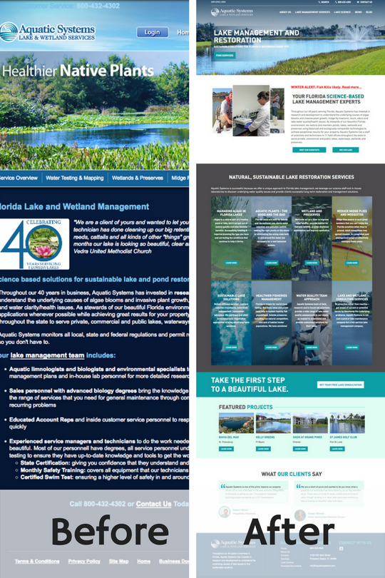
Before contacting PeakSeven, Aquatic Systems’ website left much to be desired in terms of design and usability. It became imperative that we fix this website for the better and the result was magnificent. Check out how user-friendly and useful our take on aquaticsystems.com is.
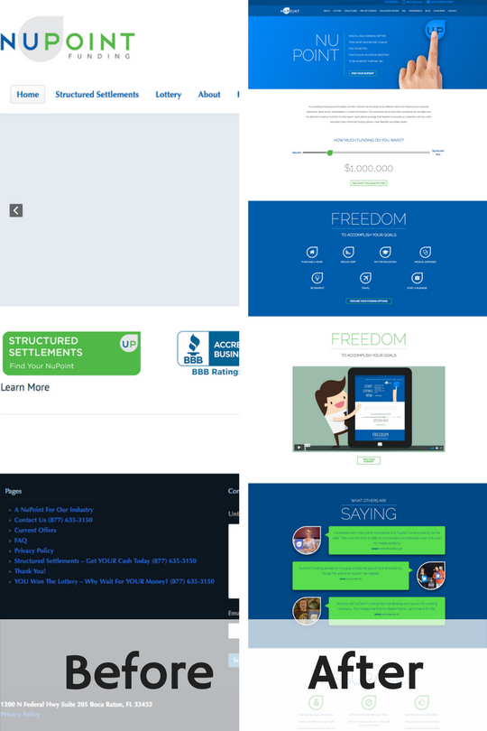
Nupointfunding.com was a fun website to design. The characters and illustrations used bring a certain joy to the site that only PeakSeven can provide. راهن على كرة القدم Not only does this site look great, but it is “markedly better” than what they had before.
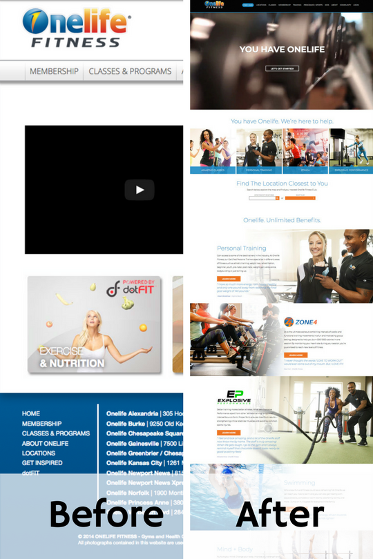
We’ll end this list with our newest edition to the websites we remade in 2017. OneLife Fitness is a brand of world class gyms operating in Virginia, Maryland and Atlanta. بوكر هولدم Having just launched this December, this website is already a big hit with gym members and staff alike! Check it out here: onelifefitness.com
We look forward to all of the amazing challenges that 2018 will bring us in website design and we are excited to be a part of such great projects coming from some of the world’s best clients!
December 19, 2015
Widely recognized as the greatest American architect of all time, Frank Lloyd Wright was known for his organic architecture philosophy – the idea that design should create harmony between humanity and its environment. In fact, according to Wright, everything should be in harmony in a design: the whole and its parts, the form and function, the layout and the movement it encourages.
Frank Lloyd Wright was an avant-garde pioneer, whose timeless designs are still relevant a century later. Although he designed physical structures, digital designers can also draw inspiration from his minimal approach to details, layouts, form and function.
DETAILS
In contrast to the ornate design and arbitrary embellishments of the Victorian era, Wright used details only to support the building’s purpose. Every element, no matter how small, helped to define the overall aesthetic style. كازينو البحرين In digital design like architecture, superfluous details create unnecessary complexity – something that no digital user wants to experience. Avoid using visual trends just to be fashionable. Instead, ensure that every detail supports and enhances the overall style and purpose of the design.
LAYOUTS
Open floor plans are now the standard in newly built American homes, but it wasn’t always this way. Home layouts were once boxy and partitioned, with more attention to structure than living space. Wright designed free and open layouts around a central point, in order to manage movement and made the space more human. Managing movement is also a crucial component for digital design, where user experience must supersede structure. Digital designers must consider elements such as contrast, balance and reading direction in order to create an open layout that promotes usability. Unnecessary navigation, modules and panels elevate structure over purpose. Instead of cramming in information, arrange content into flowing forms that allow for immediate access. القمار على الانترنت
FORM & FUNCTION
Wright believed in a spiritual union of form and function, a natural experience driven by purpose. Simple in nature, his designs were never created for the sake of impression. For digital designers, this means that content, form and the user interface should be one – a holistic experience that promotes understanding. تنزيل لعبة روليت
HARMONY
If one word could define Frank Lloyd Wright’s aesthetic approach, it would be harmony. He used indoor and outdoor spaces to create a sense of harmony between each structure and its environment. In the world of digital design, there should also be harmony between the structure and its environment – aka the application and its device. Designers must consider the environment that their creations will inhabit. What is the device’s shape? Is it mobile? How is it held? Failing to design in harmony with the environment will produce a jarring experience for the user.
Frank Lloyd Wright’s approach to architecture can be used to simplify digital interaction, and promoting harmony between the design and the device – thus enhancing understanding and usability. Pay attention to the relationship between a creation’s greater purpose and its smaller parts, and push the digital realm into brave new worlds of design.
January 16, 2015
Did You Know…
… that a menu written in an elegant, scripted font can make soup taste richer, creamier, and more enjoyable?
… that writing your product information in a familiar typeface can encourage consumers to trust your company?
… that test questions written in a funky font can force you to pay more attention – and get more answers correct?
Behold, the power of the font. Everyone knows that words are powerful, but the font (or typeface) that you choose to convey those words can have an important emotional impact. Discover the five main types of fonts below, and learn how each style can affect a reader’s emotions:
SERIF
A serif is a small line attached to the end of a stroke in a letter or symbol. As the oldest variety of typefaces, serif fonts evoke a feeling of reliability, respectability, and tradition. Impressive and authoritative, they are often used by law firms and brands that want to emphasize their prestige.
Serif fonts include the ubiquitous Times New Roman, which frequently appears in mass-market paperback books and is used in Microsoft products – making it one of the most widely used typefaces in history. العاب ربح مال حقيقي Serif fonts you may be familiar with include:
- Times New Roman
- Georgia
- Garamond
- American Typewriter
- Baskerville
SANS SERIF
“Sans” is the French word for “without” – and sans serif fonts indeed are lacking any embellishments or lines on the end of the letters. Clean and modern, sans serif fonts project objectivity and stability. These business-like fonts are perhaps the easiest to read, offering an efficient experience for the user. Popular sans serif fonts include:
- Arial
- Helvetica
- Verdana
- Calibri
SCRIPT
Also called slab serif, these elegant fonts breeze across the page with a friendly, feminine feel. Script fonts offer an air of creativity, almost like a handwritten note from an artist. They soften your message with sophisticated affection, but use them sparingly – they can be hard to understand. افضل موقع العاب اون لاين Script fonts work best when the reader isn’t in a rush. You’ll find them fairly often on menus at fancy restaurants. Example of script fonts include:
- Lucida Calligraphy
- Edwardian Script
- Bickham Script
MODERN
To convey a progressive message with strength and style, use a modern font. These chic, no-nonsense fonts are bold and edgy, and favored by tech companies. العاب كازينو مجانية Fresh and intelligent, modern fonts evoke an exclusive, in-the-know vibe. Some of our favorite modern fonts include:
- Eurostile
- Futura
- Century Gothic
DISPLAY
Unique, expressive, and a little bit funky, display fonts provide a touch of whimsy to your brand. Fun and amusing, display fonts are often used for products aimed at children – just think about the Disney logo. True to their name, these fonts are best for displays and work well in larger sizes. Display fonts include:
- Cooper
- Chalkduster
- Giddyup
- Curlz
- Eccentric
The next time you see a popular text logo, consider the font that the company is using. Does it convey the right feeling for the brand? Notice your emotional reactions to different fonts, so that you can choose correctly for your next design.
September 22, 2014
Our society’s inability to unplug from technology and demand for instant gratification mean the attention and time we can dedicate to even the simplest tasks are decreasing. Even reading factual articles on the Internet is too time-consuming for us! Content shock, as we touched on earlier, is a phenomenon where readers skip reading articles in full because they are bored, busy, or disinterested. So how do we present information to readers that interests and helps them learn? Enter infographics: content that combines text and graphics into one. كيف تربح المال من الانترنت مجاناً Could infographics solve the problem of content shock, or is it just a temporary fix to our society’s short attention span?
Visualize
Content marketers and companies alike create infographics to convey boring material in a quick, creative and meaningful manner. According to Social Media Consultant Mark Smiciklas, infographics are “a visualization of data or ideas that tries to convey complex information to an audience in a manner that can be quickly consumed and easily understood.” Remember the five senses: feel, smell, see, hear and taste. All 5 senses transmit information to the brain, but 90% of that information is visual! In an average day, a person is exposed to 174 newspapers full of information, with only 1% of that information getting through to the brain. Why is this, you ask? The brain processes images simultaneously and text sequentially, meaning that visual stimuli makes it to the brain much more quickly than textual stimuli. To be specific, the brain processes visual stimuli 60,000 times faster than text. Additionally, Google search volumes for “infographics” have increased by well over 800%. I prefer to think of infographics as children’s books for adults: mostly picture accompanied by minimal text. We teach and treat children as visual learners, so why can we not do the same for adults?
Inspire
Great infographics inspire emotions – be it happiness, sadness, wonder, or surprise. Great infographics use challenging content, tell a story, take your readers on a journey, or provide readers with a fresh point of view. As a marketing tool, infographics are viral magnets. They are easy to share due to their attractiveness and versatility across social media platforms including Facebook, Twitter, and Pinterest. Because of their viral magnetism, infographics are helpful to your webpage’s SEO and can ultimately help rank your website higher on Google’s algorithm. You can also easily increase brand awareness by simply placing your logo on the infographic. موقع مراهنات Placing your logo on the infographic allows you to position your brand as an expert of the topic you are explaining. العاب كسب المال If you are not creating your own infographic but simply sharing another’s, you can use the infographic to add value to your content. Just be sure to give credit where credit’s due, which may include the author’s name, website, and a link back to the website or place of origin.
Learn
Research done by Barbara Miller and Brooke Barnett of the Newspaper Research Journal showed that combining both text and graphics is the best method learning information. Their summary stated:
“On their own, text and graphics are both useful yet imperfect methods for communication. Written language allows an almost infinite number of word combinations that allow deep analysis of concepts, but relies heavily on the reader’s ability to process that information. Graphics may be easier for the reader to understand but are less effective in communication of abstract and complicated concepts. … combining text and graphics allows communicators to take advantage of each medium’s strengths and diminish each medium’s weaknesses.”
Think of your favorite children’s book growing up; it probably had tons of pictures and illustrations. Children books feature a combination of text with illustrations because the combination of the two media helps children understand and mentally visualize the story they’re being told. Children have more active and wild imaginations than adults, yet as we age, we find ourselves referencing and learning from text-dense material rather than a combination of pictures and illustrations. In the case of adults, you would think that with a less wild imagination, you would need more imagery to explain concepts. Infographics prove that the adult brain still prefers to learn with a combination of imagery and text than with text-dense information alone.
Research
Beyond having great content and imagery, you must always do your research before creating an infographic. Assuming you want to appear as an expert in your field, it is essential to provide your readers and customers with accurate and up-to-date information. Use multiple sources, but not too many, to gather your data: too much information can fatigue or disinterest your reader. Additionally, use multiple sources to check the accuracy of your information. Include plenty of statistics in your infographic; pie charts, bar graphs, line graphs, and percentages accompanied with images help clearly illustrate statistics and other complicated pieces of information.
Create
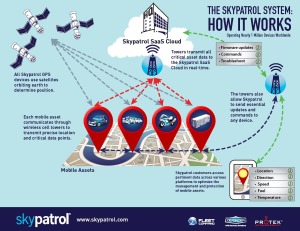
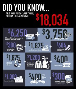
Not every company or business has a graphic design department that can readily turn out great infographics. As a content curator, your biggest challenge is not finding content, but rather finding a way to present it to your audience that is both exciting and informative. Fortunately, Peak Seven’s team of dedicated designers can make your infographic dreams become reality. Infographics allow endless possibilities for presenting dense information to readers in ways that are interesting, meaningful, and easy to understand; Peak Seven helps you master these obstacles while helping you stay true to your brand. As 65% of the population are said to be visual learners, we should be presenting information to readers that interests them and helps them learn, not information that exhausts and bores them. Think you’re ready to get started on your own Infographic? Reach out to Peak Seven today, and check out some of our recent info graphics below for Skypatrol.
-
150 East Palmetto Park Rd.
Suite 800
Boca Raton, FL 33432 - 561.465.3177
- www.peakseven.com
- moc.n1732174703evesk1732174703aep@o1732174703lleh1732174703
- in
-
621 Kalamath Street
Suite 135
Denver, Colorado 80204 - 561.465.3177
- www.bigfootweb.com
- moc.b1732174703ewtoo1732174703fgib@1732174703olleh1732174703
lest's Chat
Privacy Policy: By filling out and submitting this form, you are giving consent to receive communication from Peak Seven in the form of email, text, phone, and mail. Your data will only be used by Peak Seven. We will take all the steps reasonably necessary to ensure that your data is treated securely and that no transfer of your Personal Data will take place to an organization outside of Peak Seven's companies. We use cookies and similar tracking technologies to track the activity on our Service and we hold certain information. No method of transmission over the Internet or method of electronic storage is one hundred percent secure. We strive to use all commercially acceptable means to protect your Personal Data. You may unsubscribe at any time.